How to Make a Graph in Excel: Line Graph, Double Line, Bar, Double Bar, Column, Log, Pie Chart
Need to make a graph in Excel? Learn from our guide how to create a graph in Excel with just a few simple steps. Our guide covers creating various types of graphs in Excel, including line graph, double line graph, bar graph, double bar graph, column graph, log graph and pie graph. Just follow these instructions.
Ever felt swamped by spreadsheets full of numbers? You're not alone. Turning that sea of data into something understandable can be a game-changer. That's where knowing how to make a graph in Excel comes in handy. Excel isn't just a bunch of grids and cells; it's a powerful tool that can turn your data into visuals that actually make sense.
You don't have to be a tech wizard to make a graph in Excel. The software is super user-friendly, and you'll find it's easier than you think to whip up a graph. Whether you're crunching numbers for a school project, presenting sales data at work, or just geeking out on stats, Excel has got you covered.
From classic line and bar graphs to the fancier double line and double bar graphs, and even specialized ones like column, log, and pie charts - Excel offers something for everyone. So stick around, because this article will walk you through how to make a graph in Excel, step by step. Trust us, your data will thank you!
How to Make a Line Graph in Excel
Line graphs are very easy to make and are very effective to use. You can use such graphs to convey information that can be represented in a series. For example, you can use the line graph while trying to convey information regarding the margin of profit your business had for the past 5 years. Let's seehow to make a line graph in Excel.
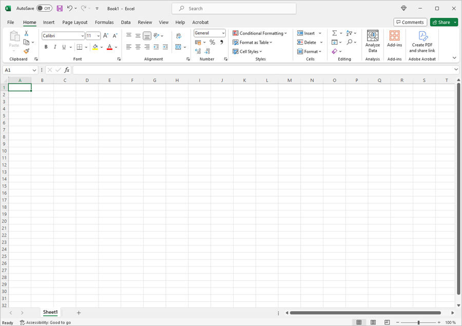
The first step would be to open a new Excel document.
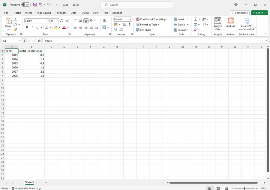
Next, you will need to write down the values to be added. In this case, the values would be, 'year' and 'profit'. The profile will be considered in millions. This is how you will write it down.
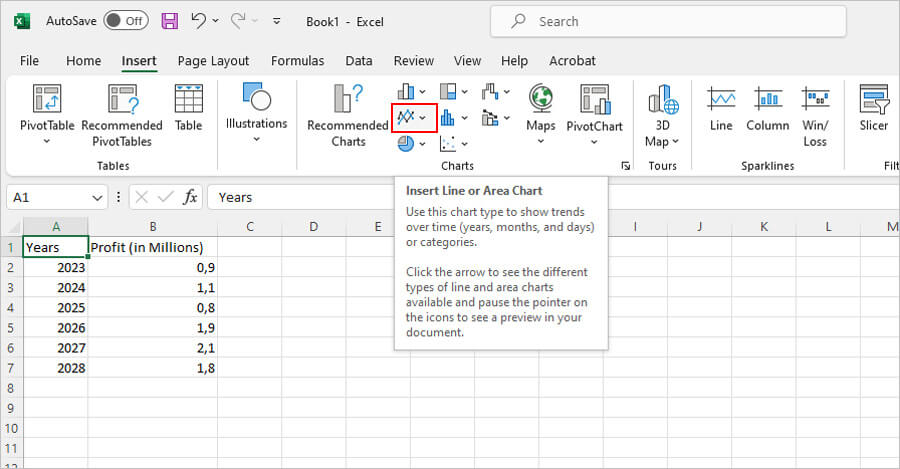
After you have entered the values, you will now need to create the graph. The next step would be to find the line graph option. You will find it in the insert section as shown below.
Once you click on this option, you will have a various line graphs to choose from. However, you will need to select the following.
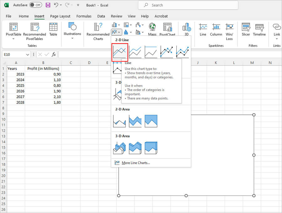
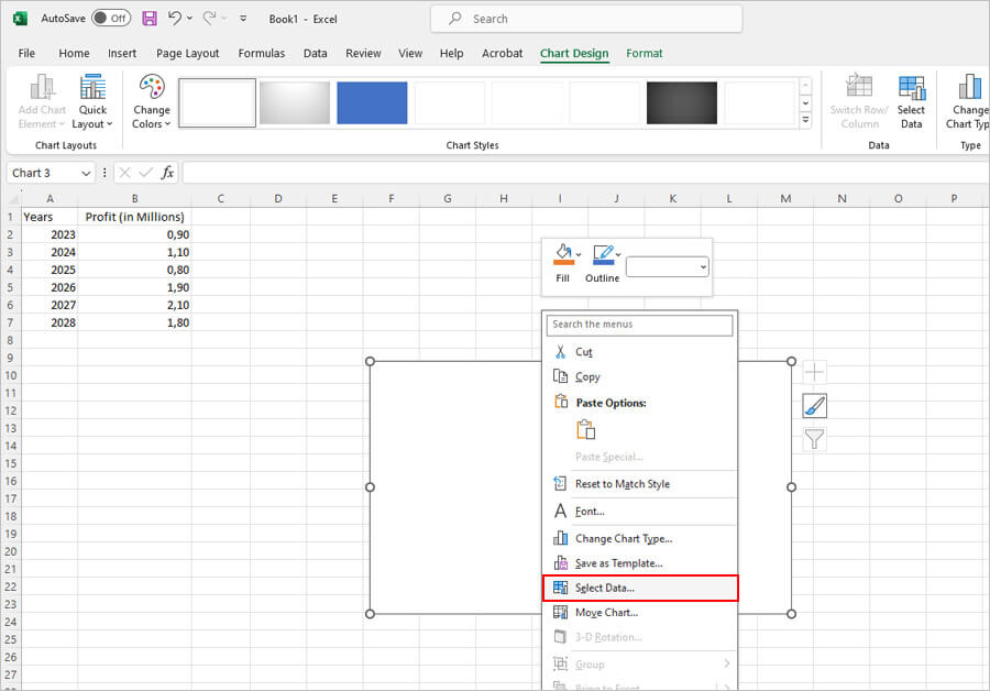
This is a basic Line graph apt for presenting such type of information. However, as you can see, presently, there is no graph on the white box. This is because appropriate data hasn't been entered. Hence, the next step would be to add the data entered so that it can be represented in the form of a graph. This is how you will do it. Right-click your mouse inside the plain white box and click on Select Data.
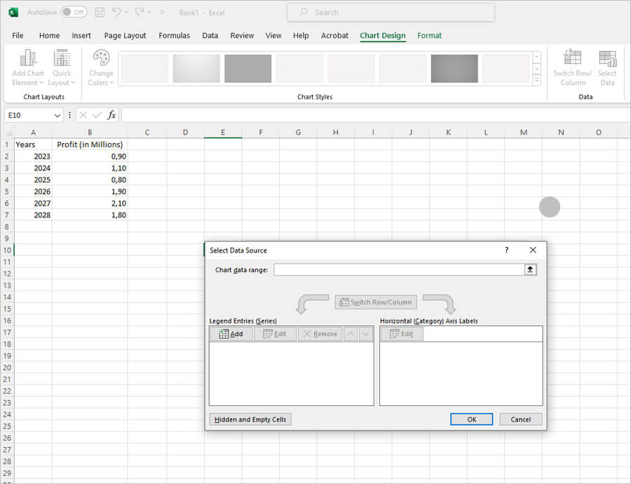
Once you click on select data, another box containing options to add data will open. Here, you can add series and categories. This is how the box looks.
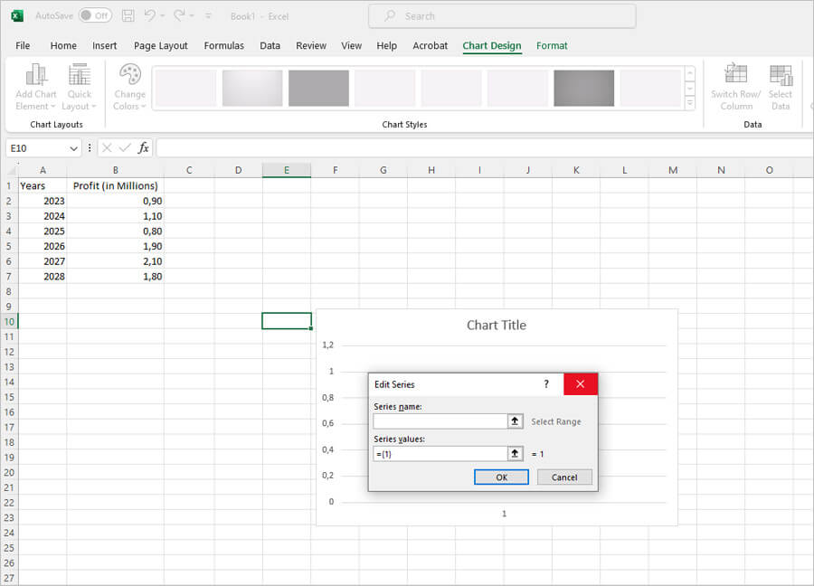
Click on the 'Add' button in the series section. Another small box through which you can add your details opens up. This is how it looks.
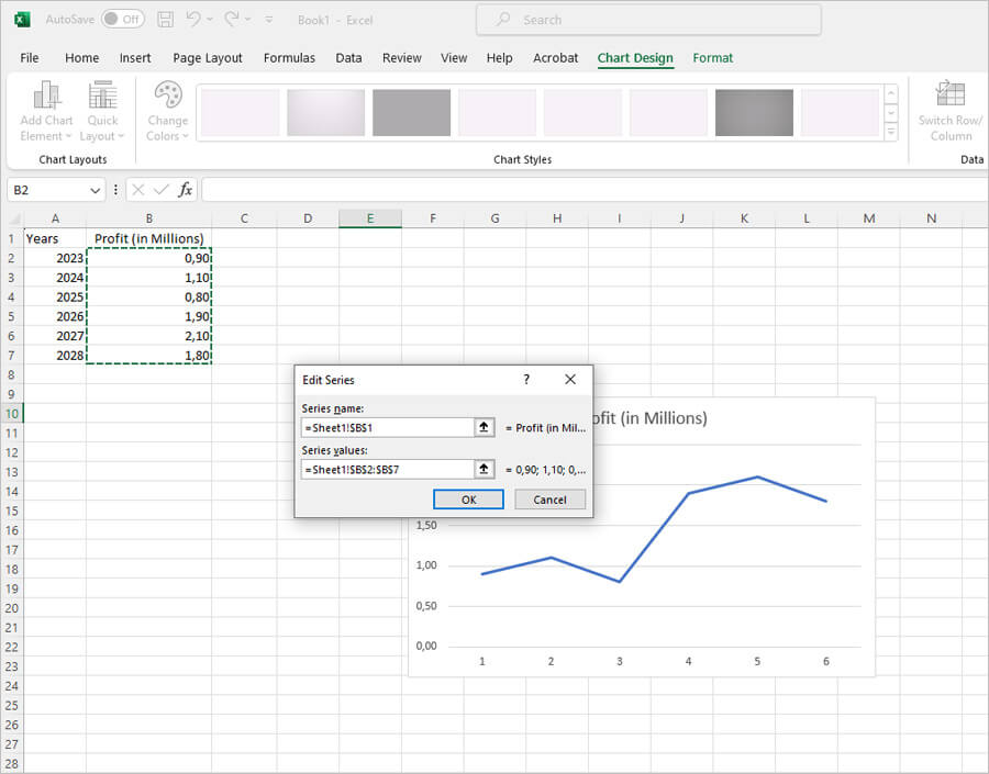
In the 'Series Name' section you will add the Profit that you want to show. Remember that you will need to enter the same name that you wrote. In this case, "Profit (In Millions). For the 'Series Values', you will need to add the values of the profit. To do this, select the first value and drag the cursor down to the last value and release. That will automatically add the values to the values sections. If you did it right, here's how it would look.
Your next step would be to add the categories to the graph. In this graph, we only have one category and that is 'Years'. To add this category, you will need to click on the edit option in the category section. Here's how you do it.
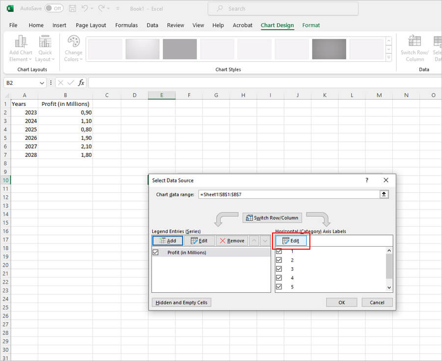
Once you click on the edit button, a small box will open. Through this, you can add the values in the Year category. To add the values, you will need to select the first value and drag the cursor down to the last value and release. Here's how it would look if you're doing it right.
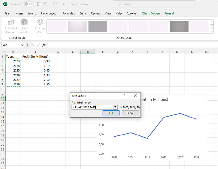
After you click on OK, you will be directed to the main box once more. Click OK on the main box and your graph is complete. This is how the line graph would look like.
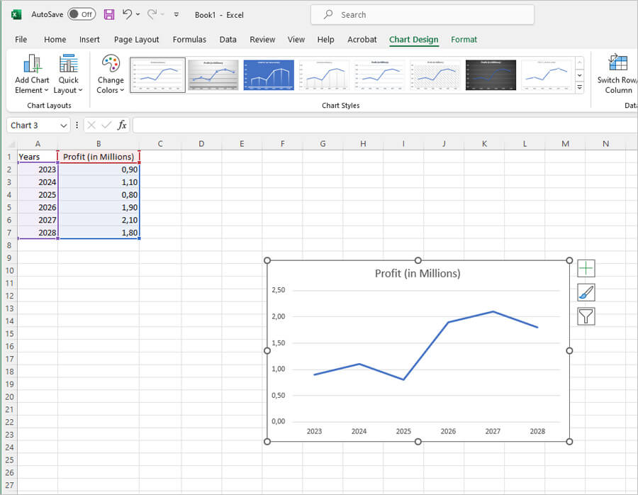
Now that we have understood how to create a line graph, let us move on to the column graph.
How to Make a Double Line Graph in Excel
The next graph we will see made is the double line graph. The only difference between the line and the double line graph is the number of lines. This means you can show more data in the double line graph. So, using the same example, we will consider how to make a double line graph in Excel.
The double line graph will have more than one data series. So, for the purpose of this example, we will add another data series and call it Expenses and we will measure it in thousands. This is how the data will look like.
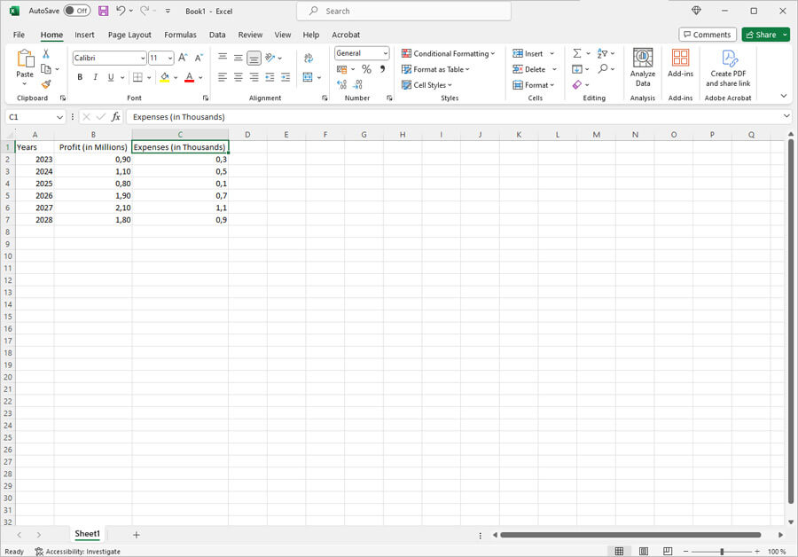
After this, the process is pretty much the same as with the line graph. That is until we reach the part where we have to add the series to the line graph box. So, after you right click and choose the "Select Data" option, you will have to choose the series. Refer to the line graph to see how this is done. Now, after you have selected and entered the profit series you will be redirected to the main add series and axis labels box. Once here, to add the next range of series you will have to again click on the Add button.
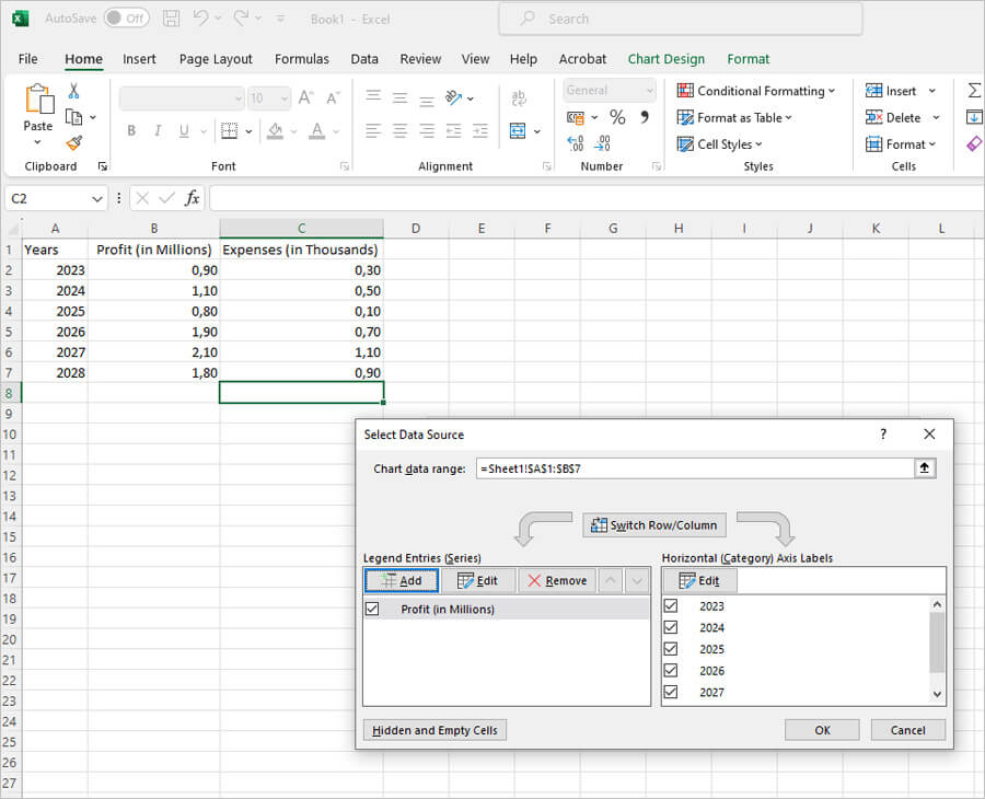
This will open up the edit series box again. At this time, you will have to enter the next series in your data - in this case Expenses. Here's how it would look.
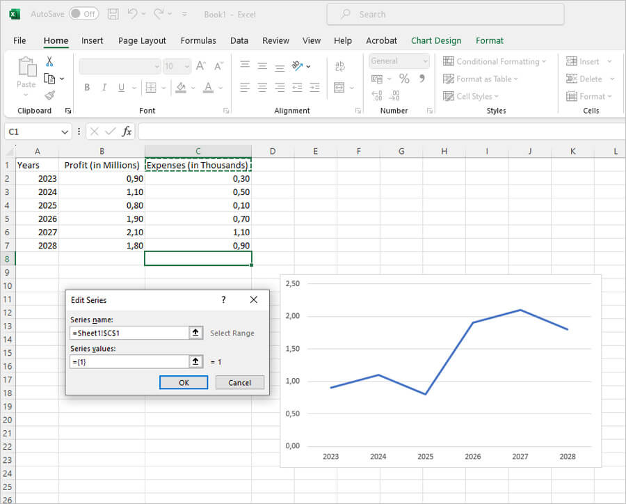
The method for entering the series data remains the same. That is, select the first series value, drag the cursor to the last value and release. The data will be entered automatically. After this is done, click on OK to move on.
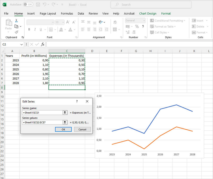
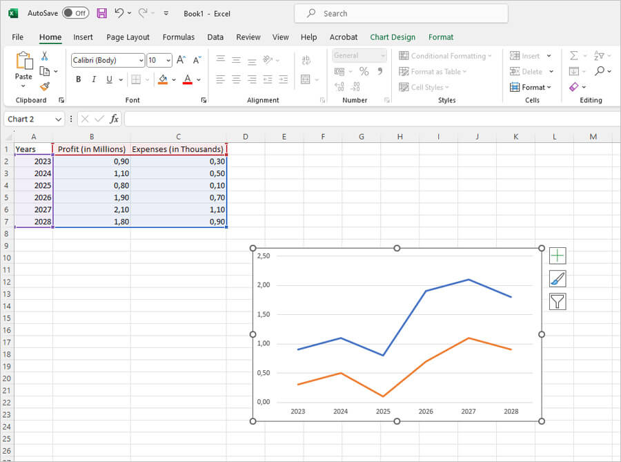
After you have entered the expenses series data you will have to enter the axis labels one more time. Once this is done, click on OK. This is how the double line graph will look like.
How to Make a Bar Graph in Excel
Bar graphs are like column graphs, except they are horizontal. The method of making these graphs is the same as with all the rest. So, read on to find out how to make a bar graph in Excel.
The first step would be to enter the data in the Excel document. For the purpose of continuity, we'll use the same example as the one we used for the double line graph. In the example, we'll see how we can make both the bar graph and the double bar graph, as they use the same principle.
Our first step is to open a new document and enter the data.

Since we are considering the bar graph first, the next few pictures will contain only one series. Our next step is to go to the insert section and find the bar graph option. This is how it will look.
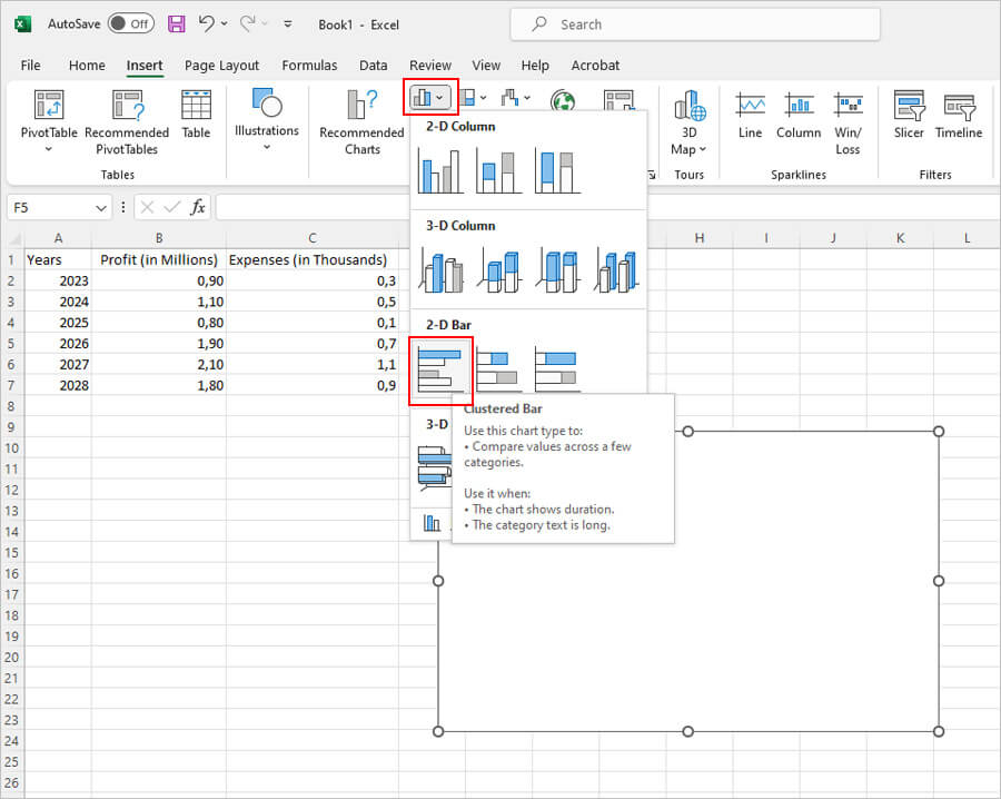
After you have selected the bar graph option, right click on the white box and choose the "Select Data" option.
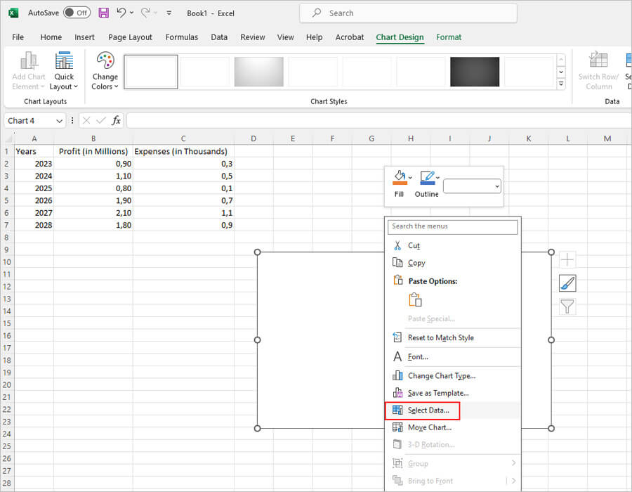
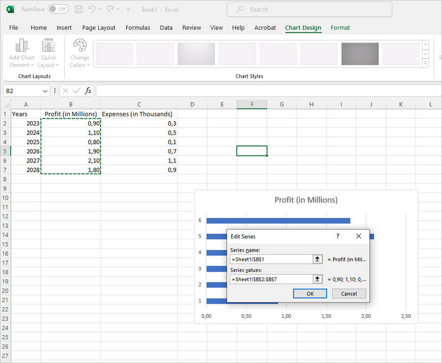
To enter the data, you will have to select the series and the axis labels. We'll first select the series and then the axis labels. Enter the name in the series name section accurately. It needs to be the same as the original data. Once this is done, select the values by dragging the cursor over the required values.
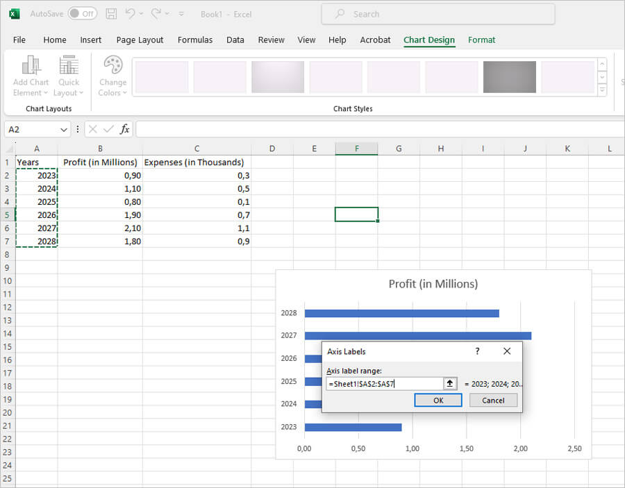
After this, pick the axis labels; this can also be done by dragging over the required data.
When you click okay, you should be able to see the bar graph complete.
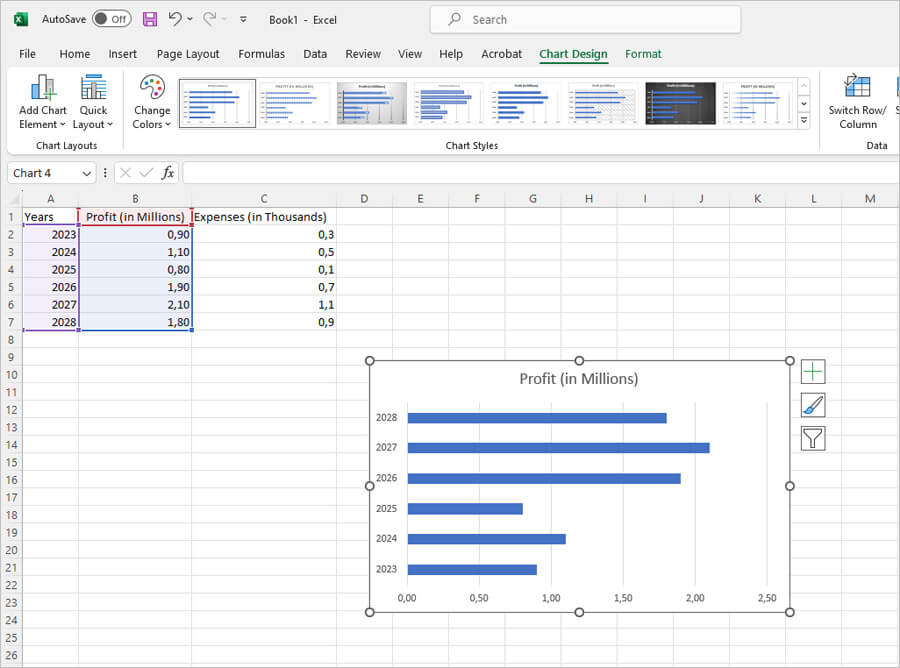
Now, we will consider the double bar graph.
How to Make a Double Bar Graph in Excel
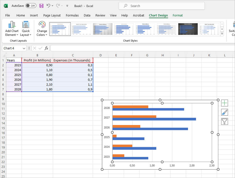
As the name suggests, the double bar graph will have two bars, so we will have to add the "Expenses" series to this graph. Read on to find out how to make a double bar graph in Excel.
All you have to do is right click on the bar graph box and click on "Select Data". Once the box opens up, instead of adding the name and value of just one series, you will add two series like you did with the double line graph. Here is how it would look like.
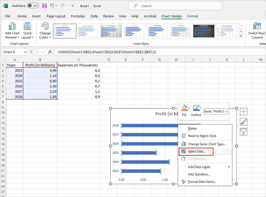
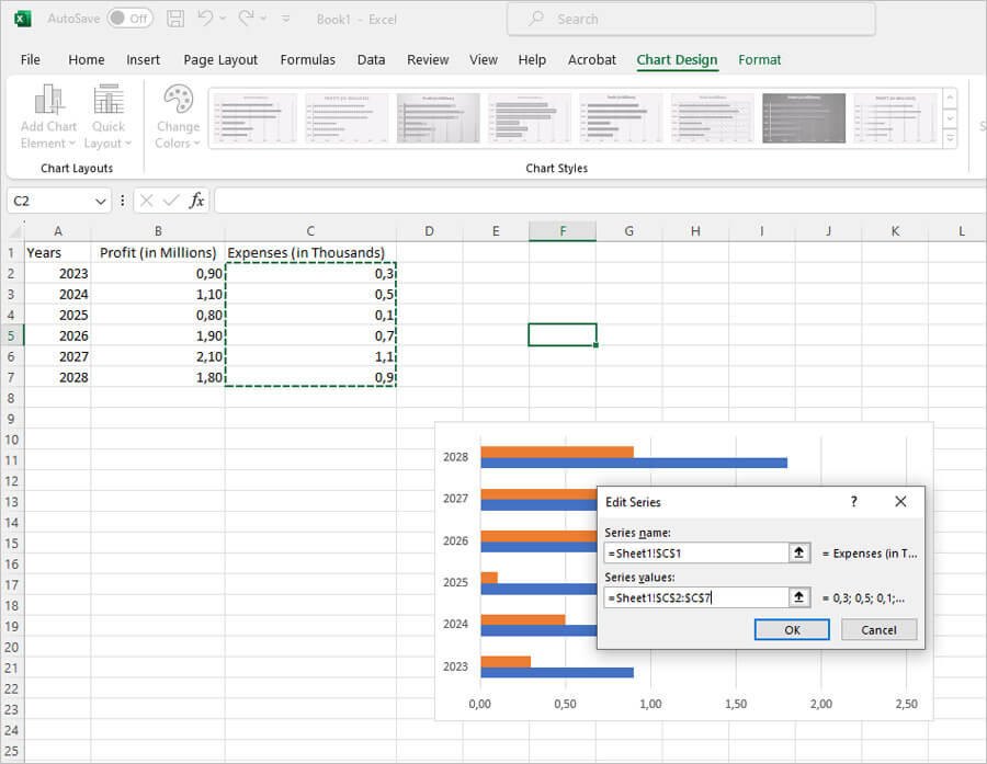
Once you have added the series you will have to add the axis labels once again, this time for the new series that you have entered.
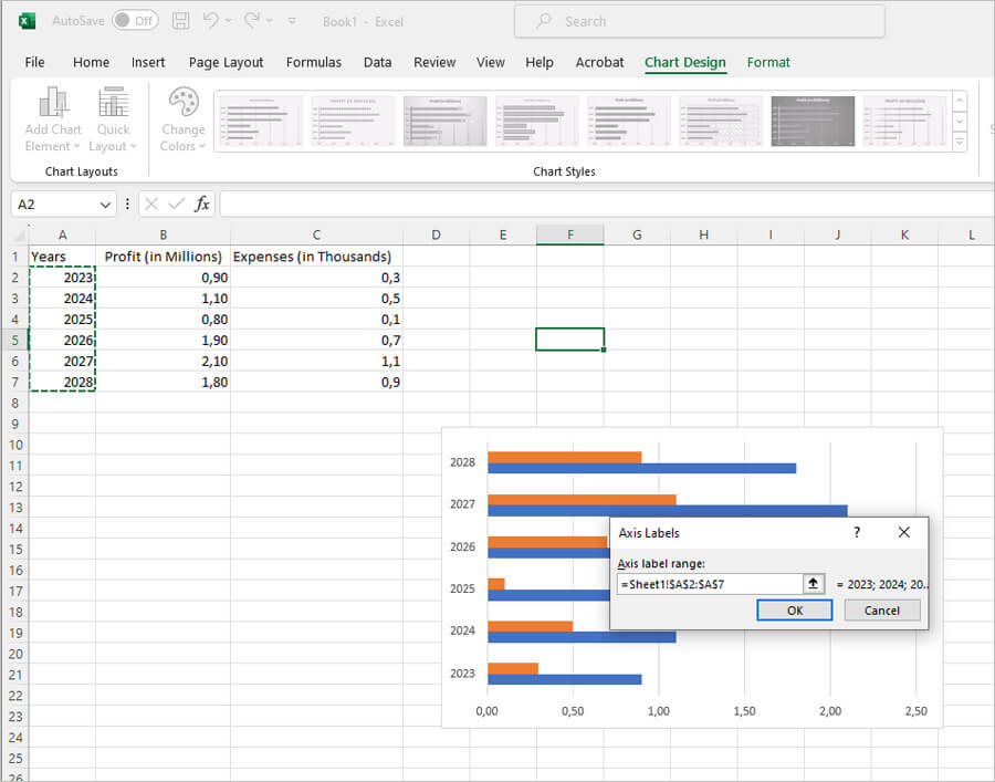
After you have done this, click on OK. You should now be able to see the double bar graph.
How to Make a Column Graph in Excel
Column graphs present data in the form of columns and therefore are highly effective when trying to make comparisons. For example, using the same data we used for the line graph, we can create a column. Consider a requirement to show your clients the profits you have made over the years. The point you are trying to make is that your business is a progressive one and that you are trustworthy. Below is the simpliest wat to make a column graph in Excel.
The first step will be the same as we followed while creating the line graph. Open a new document and enter your data in it. This is how it would look.

Once you've entered the data, you will need to create the graph. This is where you will find the column graph option.
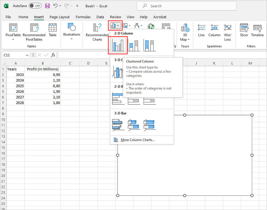
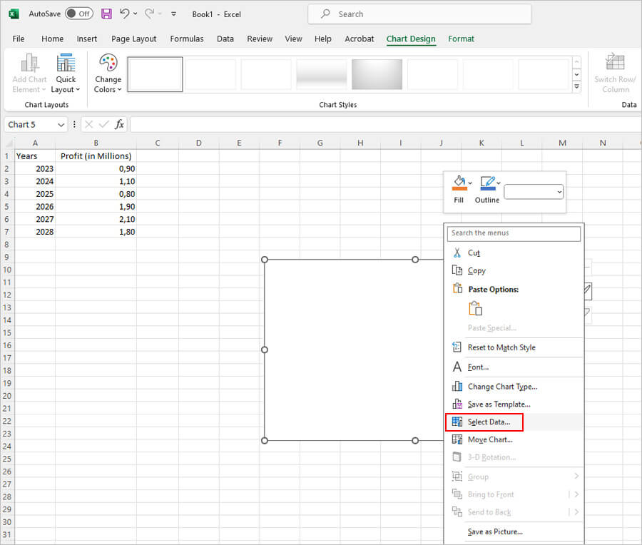
The next step is to fill the data in the white box. The process of entering the data is the same. You will start by hitting the right click button on your mouse inside the box and click the "Select Data" option as shown below.
This would open the box where you can fill in your data (years and profit, in this example). These are also called legend entries or series and axis labels, respectively. From this point on, you will need to be careful of what you type and select. Considering the previous example, mention the series name accurately and select the corresponding data. The name of the series has to match the label given in the sheet's data (in this case, Profit (in millions)).
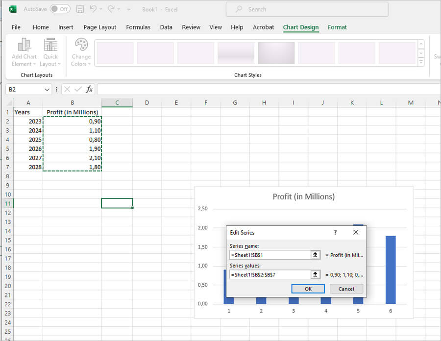
The axis labels are entered the same way. Select the first axis label and drag down to the last and release. This will automatically add the data to the axis label box as shown below.
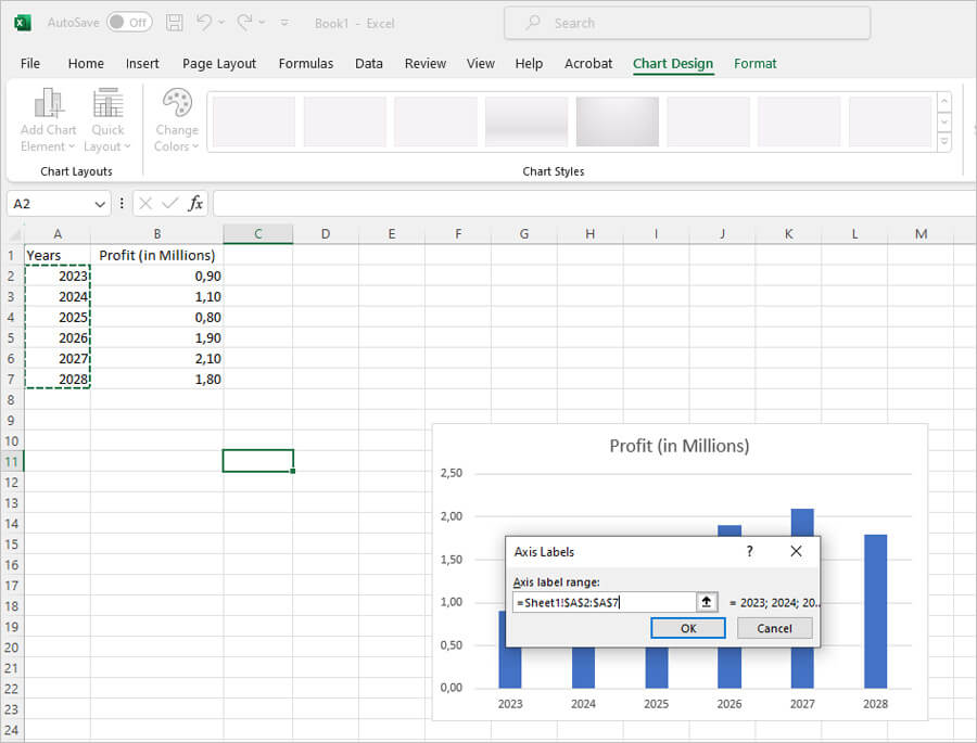
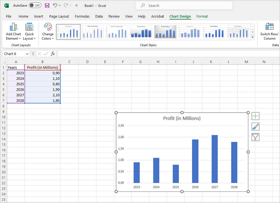
Once you entered the data, click OK. If you have done it right, then this is how the graph will appear.
How to Make a Log Graph in Excel
Now that we have completed the pie chart, we can move on to the last one and that is the log graph.
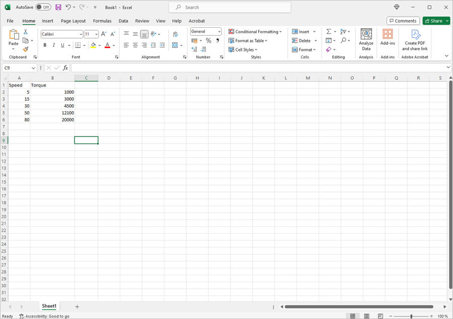
Log graphs are a great method for showing rate of change; for example, how torque changes with speed. Let's use the example of speed and torque to make a log graph in Excel
Our first step would be to open a new document and enter the required data.
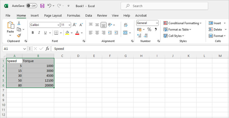
To create a log graph, you will need to find the appropriate graph to use. However, before you can do that, select all the data for the log graph first. The following picture will show you how. The log graph pre-records all the data. This saves you the time of having to add the data yourself. However, the method of adding data by choosing "Select Data" option can also be used.
Now that you have selected your data, you can find the log graph option and select it. This is how the graph will look now.
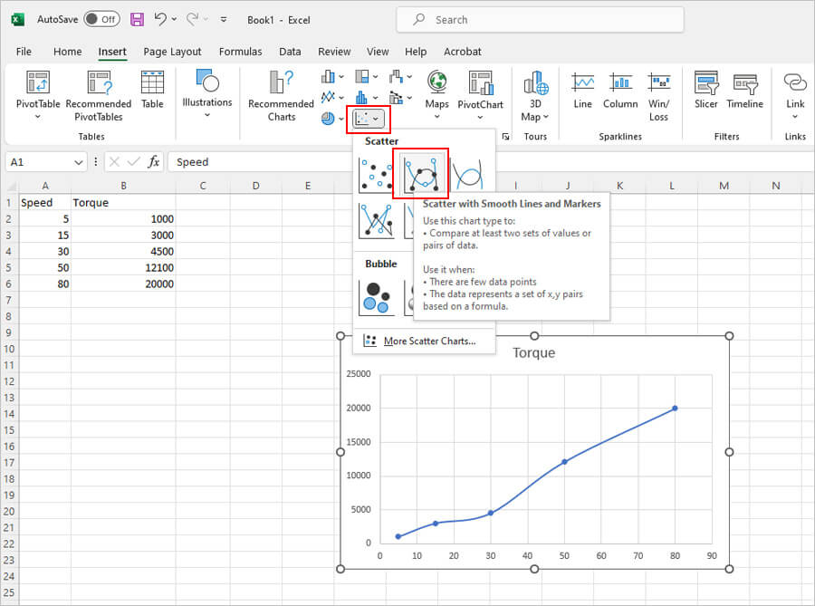
There are still a few edits left. You have to switch on the logarithmic scale for each of the axes. So, the first step would be selecting an axis. This is how it would look.
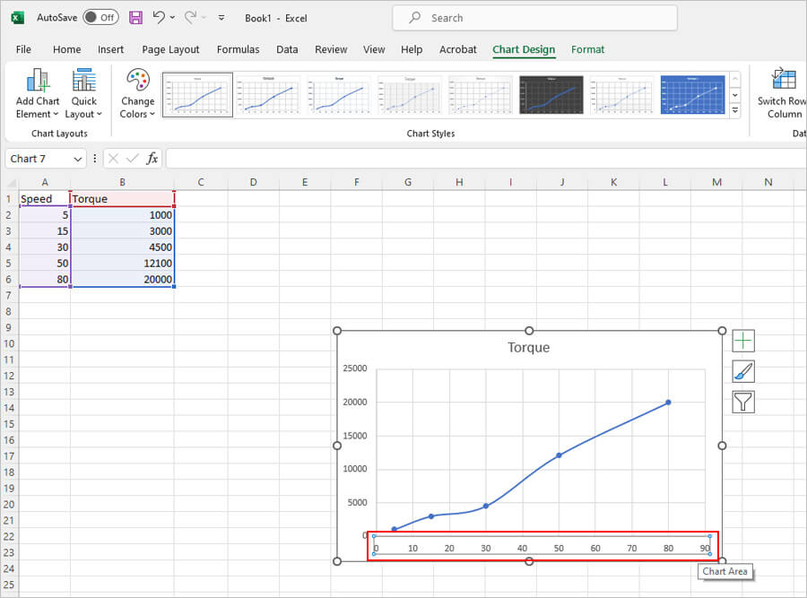
Once you select the axis, right click and select "Format Axis" option.
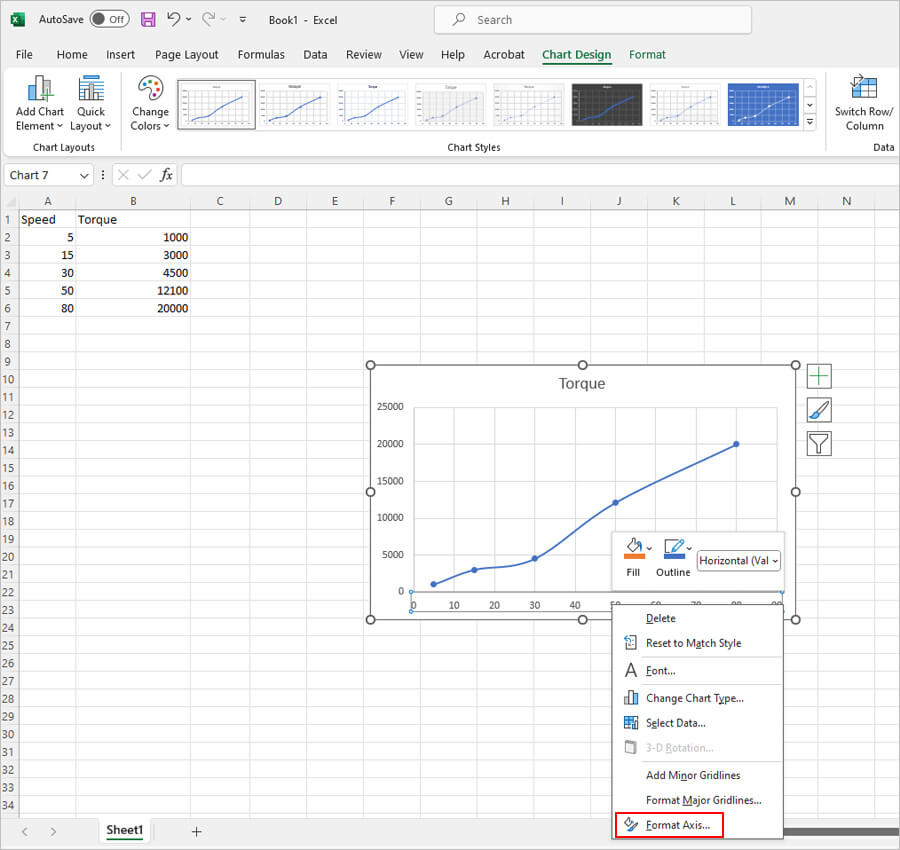
The edit options are shown to the right side of the screen.
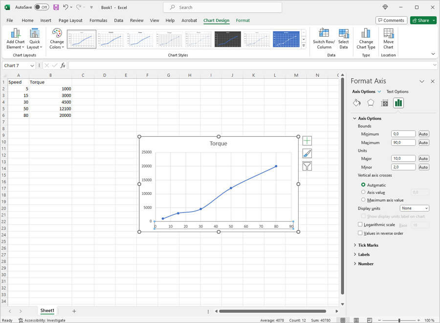
Here, you can make different edits to the axis. However, our aim right now is to switch on the logarithmic scale. Here's where you will find it. Simply check the box and your work for this axis is complete.
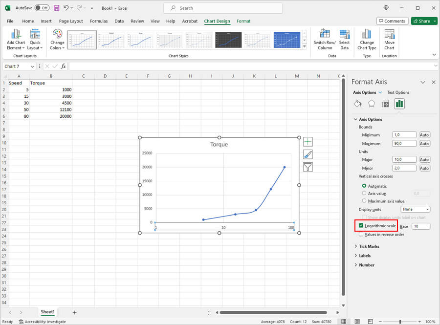
Now, you will have to do the same for the next axis. After you are able to select it, right click and select the "Format Axis" option. Once you do this, the edit options will show to the right of your screen. Again, here, you will check the logarithmic scale option as shown below.
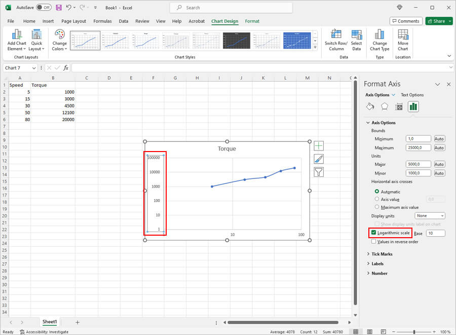
Now that this is done, close the format axis window. What you are left with is a complete log graph.
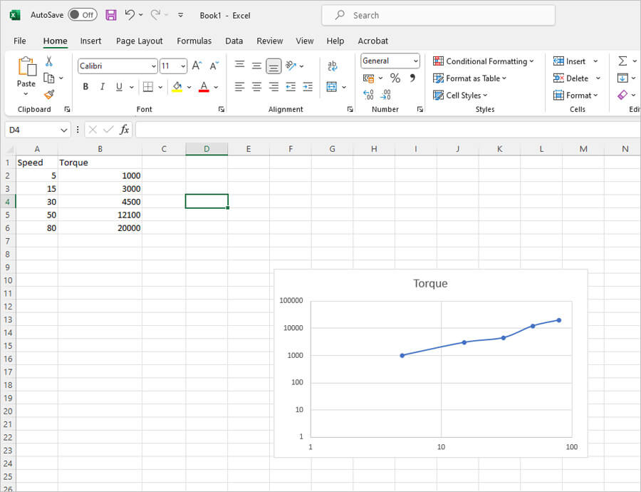
Graphs are an amazing and effective way of presenting data. With Excel, creating graphs is as simple as ever. Its algorithm allows it to calculate values and present data in a highly sophisticated manner.
Apart from this, with Excel, you also have the added advantage of formatting many aspects of your graph. You can also change the legend position, that is the axis labels. So, the next time you want to create a graph, you can bet that Excel will get the job done for you.
How to Make a Pie Chart in Excel
The next graph we will consider is the pie chart. Pie charts are effective when you're trying to make comparisons. We can use the same example to show how to make a pie chart in Excel.
The first step is always the same – open a new Excel document and enter the data. Once you have entered the data, go to the Insert option and find the pie chart option. Select the first one as shown below. Once you have done this, you can then enter the data in the pie chart.
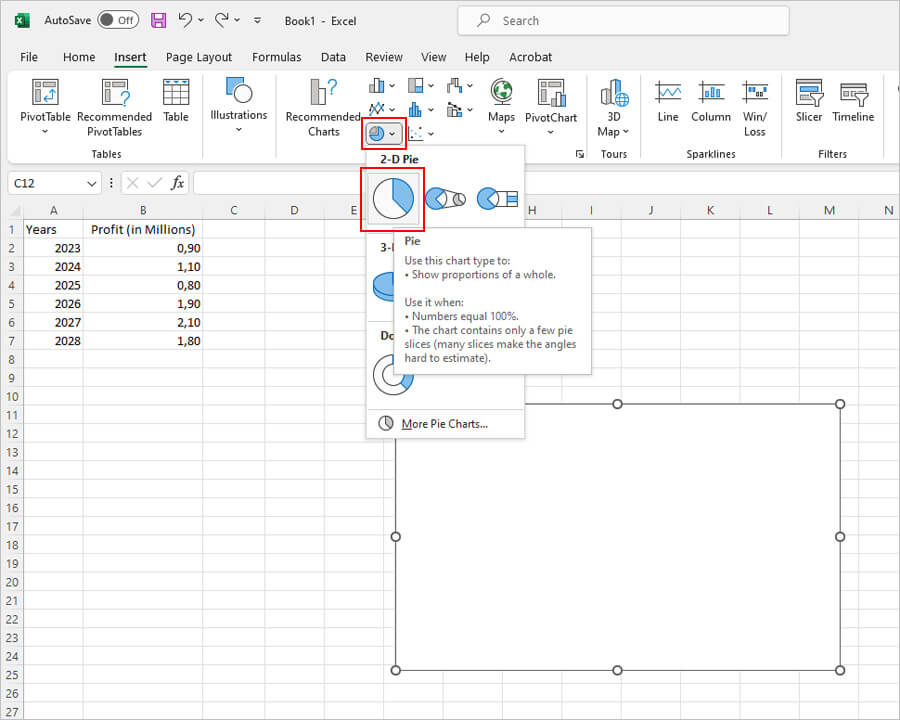
To enter the data, right click inside the box and choose the "Select Data" option. The process is again very similar to all the other graphs.
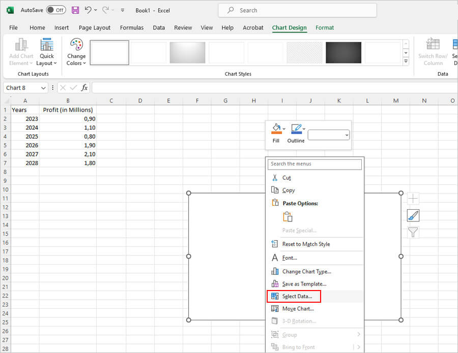
Pie charts are best understood when the data you enter is clear and crisp. That means you will have to ensure that the axis labels and series values compliment each other. First, select the series values and then select the axis labels.
Enter the right series name and value and then move on to the axis labels. Remember, to select the values, select the box from where the values begin and then drag down to the last one. Once you are sure that your desired values have been selected, release the mouse button and the data will be entered automatically.
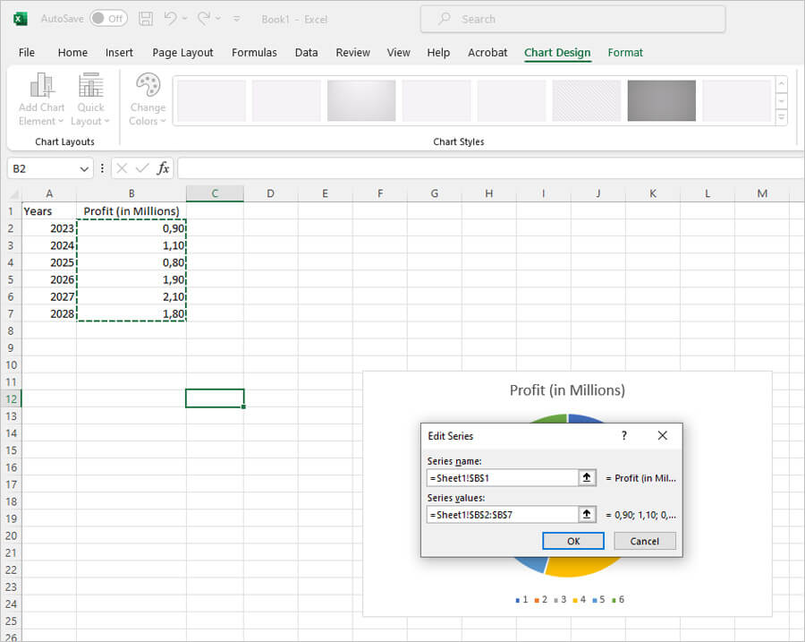
Once you are satisfied with the entries, click on OK. After this you will have to do the same for the axis labels.
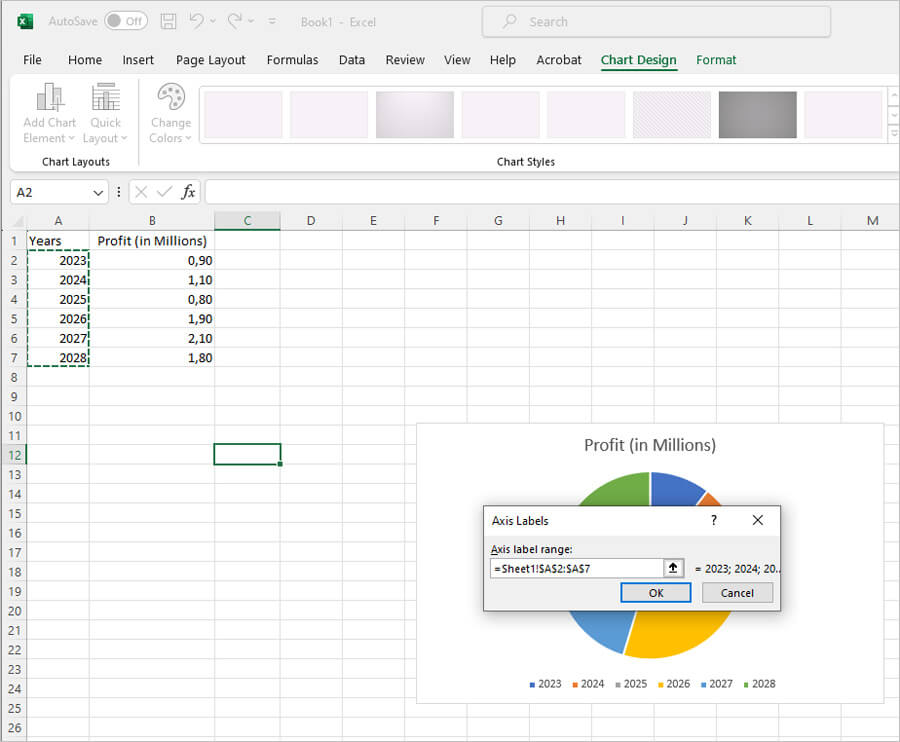
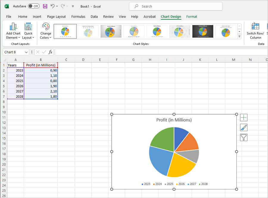
After you have entered both the details, click on OK. Your pie chart is now complete.
Graphs are an amazing and effective way of presenting data. With Excel, creating graphs is as simple as ever. Its algorithm allows it to calculate values and present data in a highly sophisticated manner.
Apart from this, with Excel, you also have the added advantage of formatting many aspects of your graph. You can also change the legend position, that is the axis labels. So, the next time you want to create a graph, you can bet that Excel will get the job done for you.

Kenneth Rhodes
Kenneth Rhodes is a tech-savvy entrepreneur and writer with a deep-rooted passion for artificial intelligence, cryptocurrencies, and social media. An MIT graduate in Computer Science and Engineering, he has significantly contributed to the tech sector through roles in software development and innovation management. Kenneth is the founder of AquaGen, a groundbreaking startup that innovates in the field of extracting drinkable water from the atmosphere, aiming to alleviate water scarcity in arid regions.

Comments (0)
Write a comment. Your email address will not be published.